bridge the gap in learning in a classroom while utilizing museums as centers for experiential knowledge.
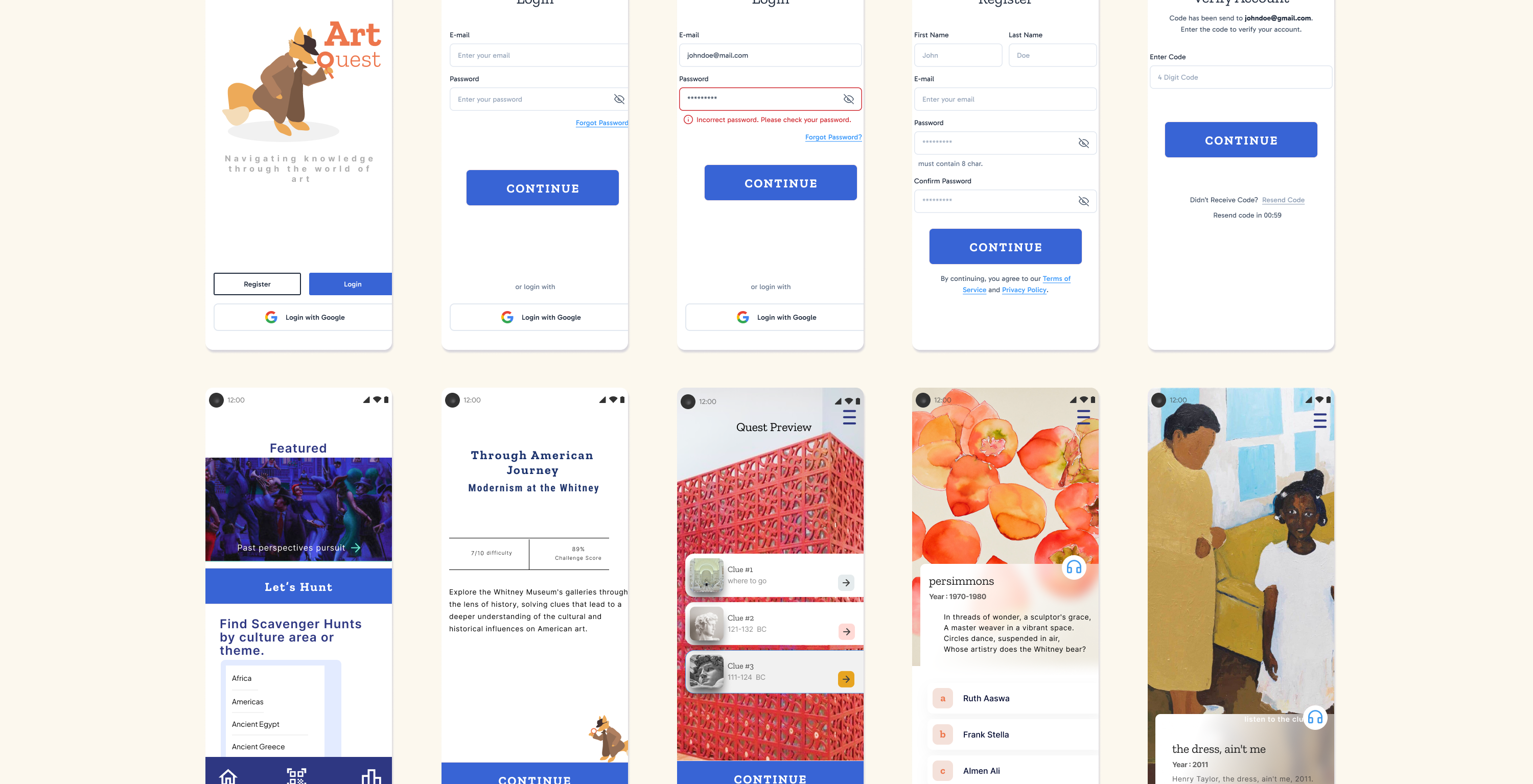
led the end-to-end design of a scavenger hunt app that reimagines museum visits as interactive, educational adventures. I conducted competitive analysis and in-person user research at the Whitney Museum to inform the design, ensuring it served educators, students, and casual visitors alike. By blending playful UX with institutional goals, I created a product concept that supports learning, engagement, and long-term member retention.
End to End feature designer co-working with an independent museum foundation and the Whitney Museum of American Art.
In an age where technology plays a central role in entertainment and education, museums often battle the problem of many museum-goers, especially younger visitors, finding traditional tours passive or overwhelming, leading to disengagement and missed learning opportunities.
Starting this process began with the presumption that traditional audio tours often fail because they deliver static, one size fits all narratives that don't really adapt to visitor curiosity or pace.
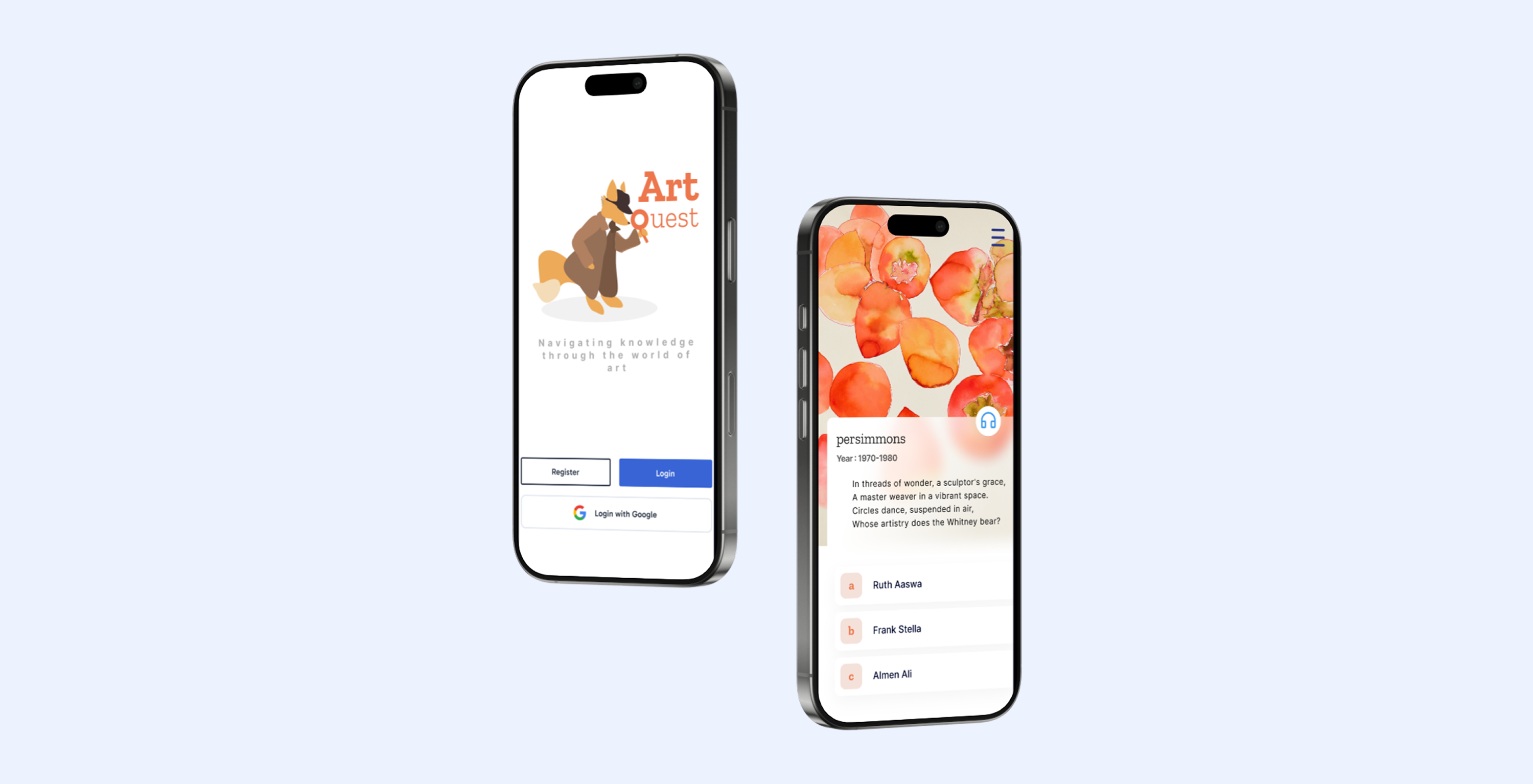
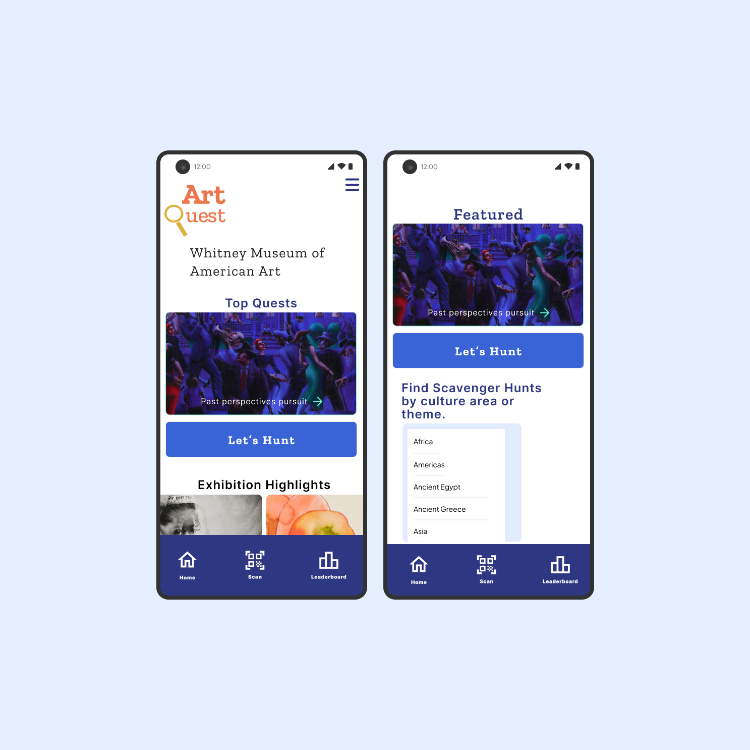
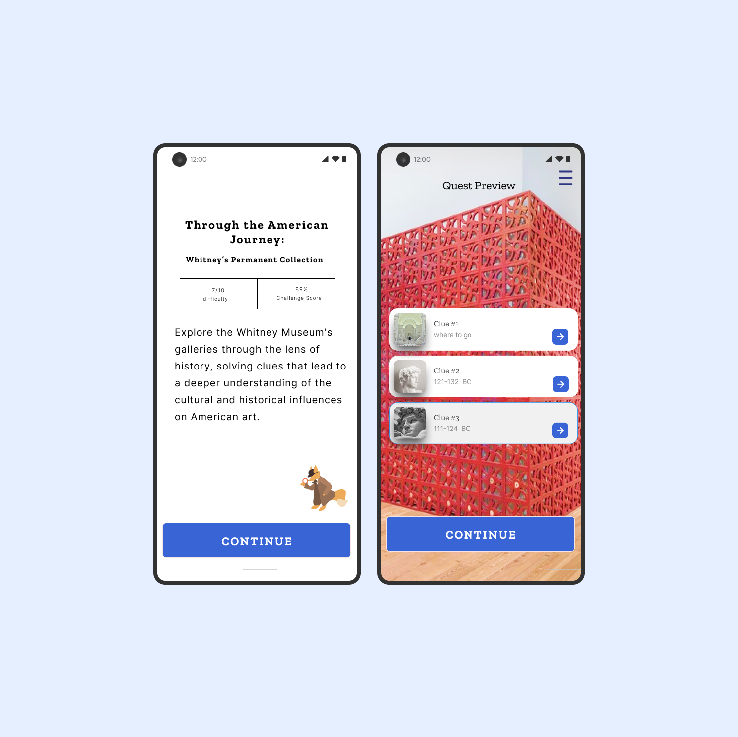
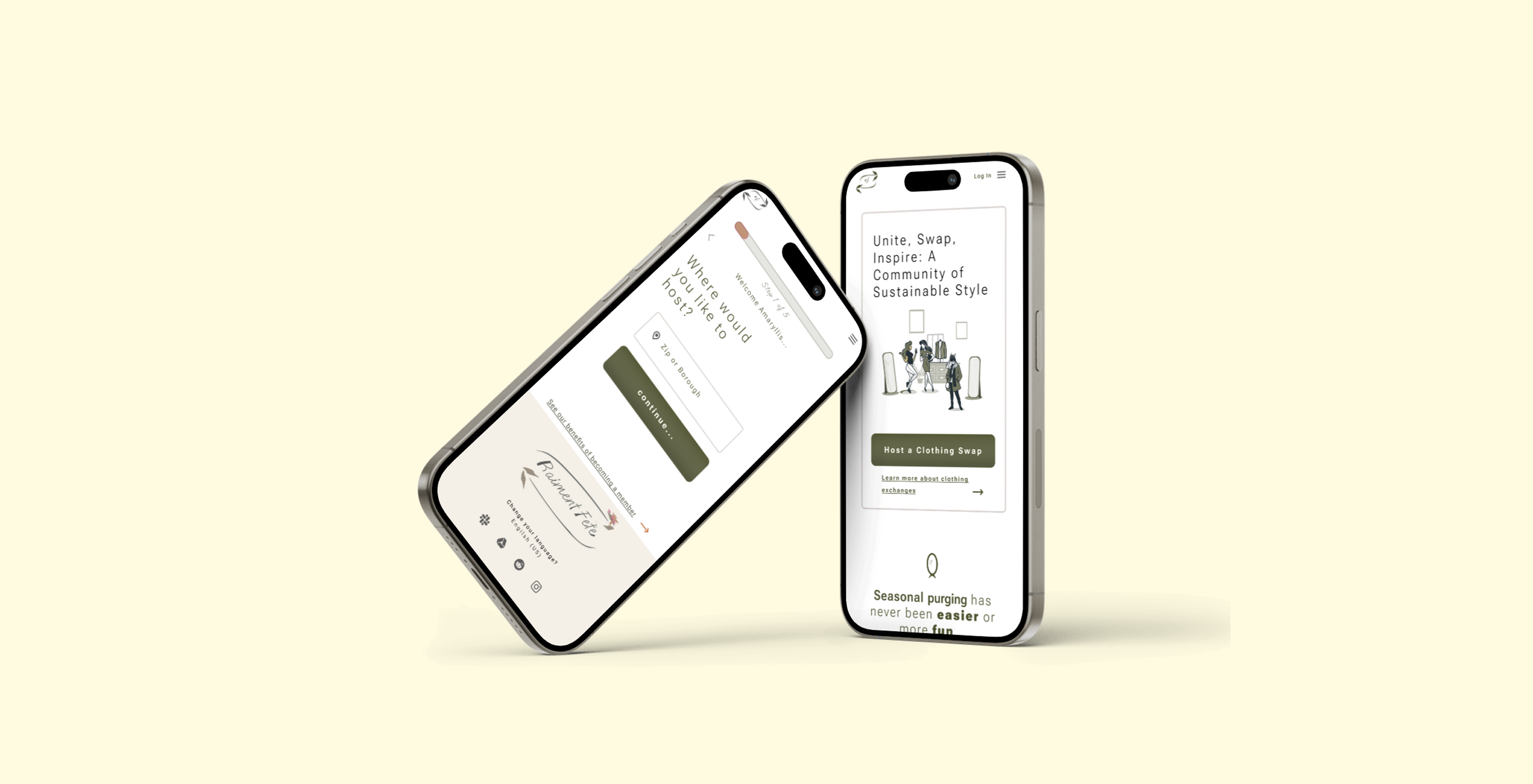
Below outlines my design for ArtQuest, a mobile scavenger hunt experience that transforms museum visits into interactive clue driven journeys through art. By connecting education teams, teachers, and everyday visitors, it deepens engagement and supports membership retention through play.
I conducted a deep dive into platforms like ClueKeeper and Scavify, as well as existing museum apps. This helped me understand the market landscape and where ArtQuest could stand out. I paid close attention to gaps in educational value, UX flow, and how much joy each app sparked in the user journey. Mapping user needs and market gaps to shape ArtQuest’s design direction.
.png)
.png)
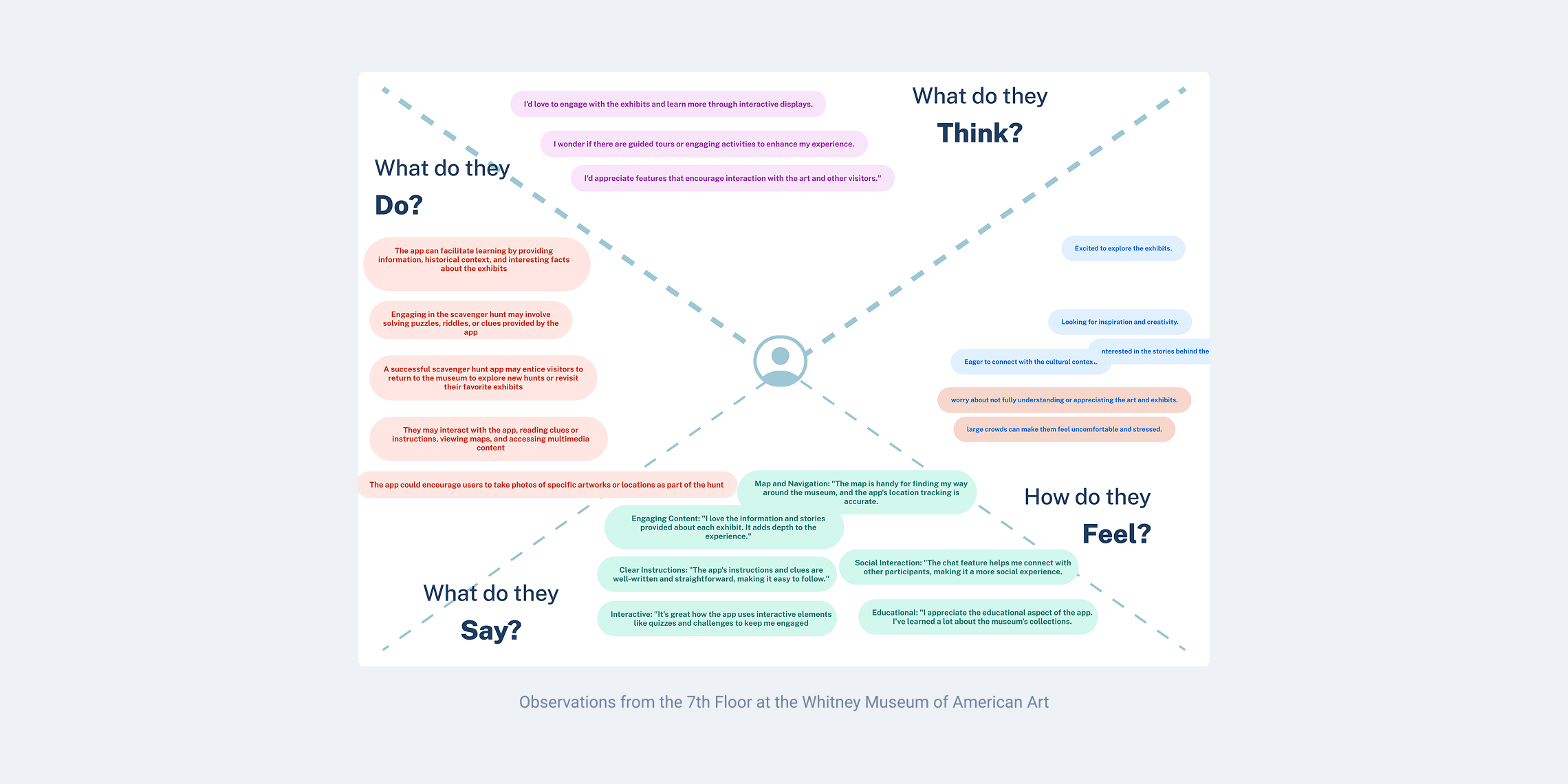
To better understand user behavior, I observed and interviewed museum-goers at the Whitney’s permanent collection. I mapped their needs and emotions using empathy maps, and tested rough prototypes to learn how they engaged with art in physical space. Their feedback directly shaped how I built clues and guided flows.
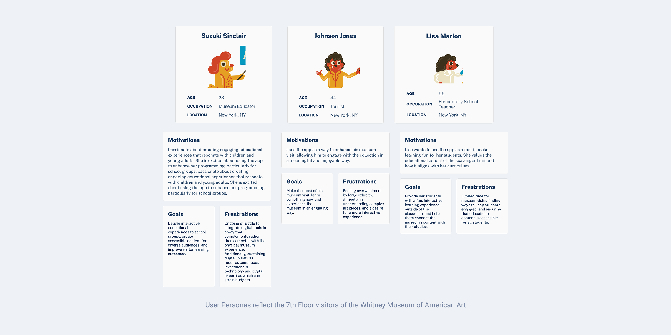
To guide user-centered decisions, I created three personas representing the diverse needs of ArtQuest’s audience. These personas helped ground the design process in empathy and ensured the experience would be relevant and engaging across educational, casual, and instructional contexts.
By focusing on a museum educator, a tourist, and an elementary school teacher, I captured a range of user goals and expectations to inform a more inclusive and adaptable experience.
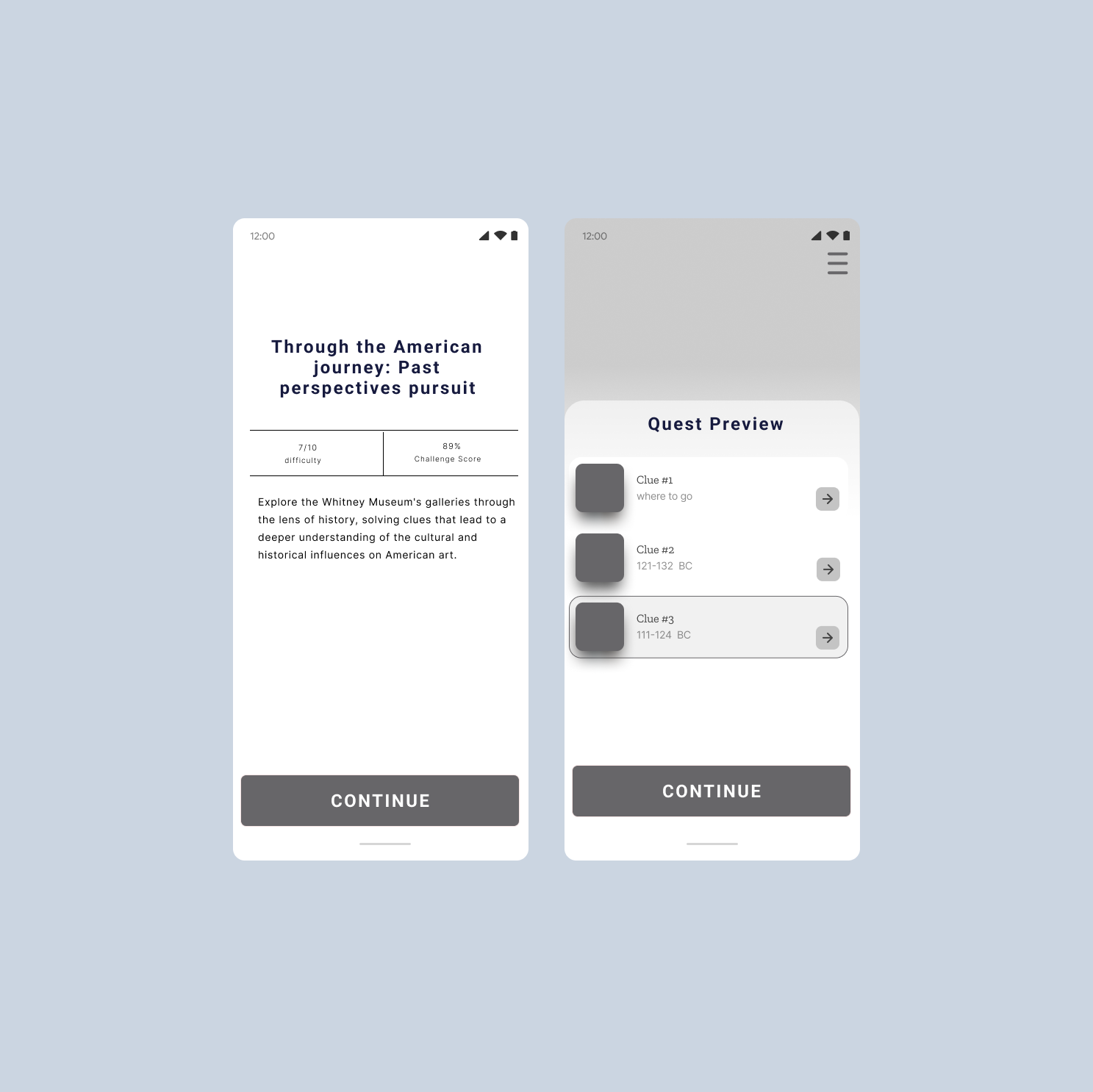
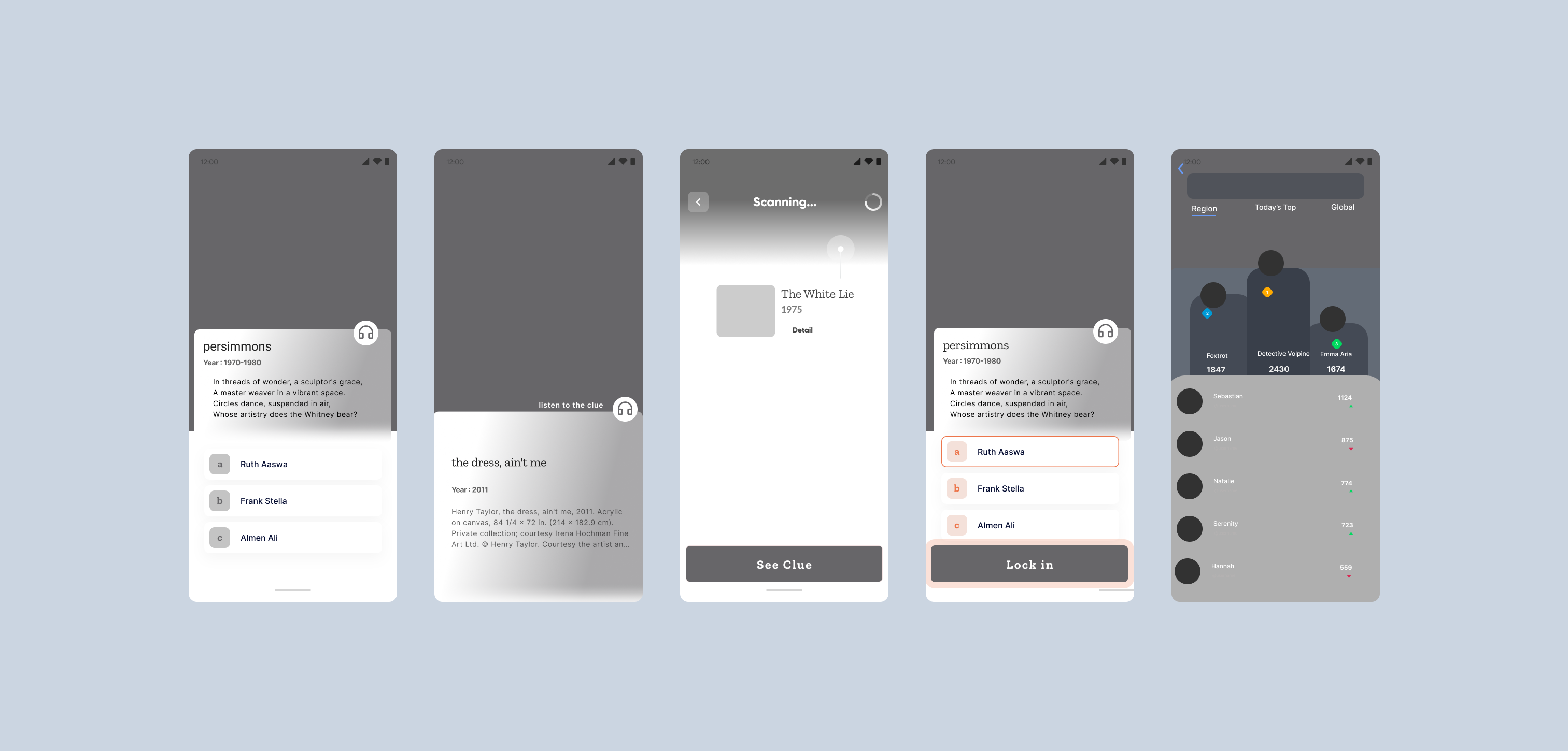
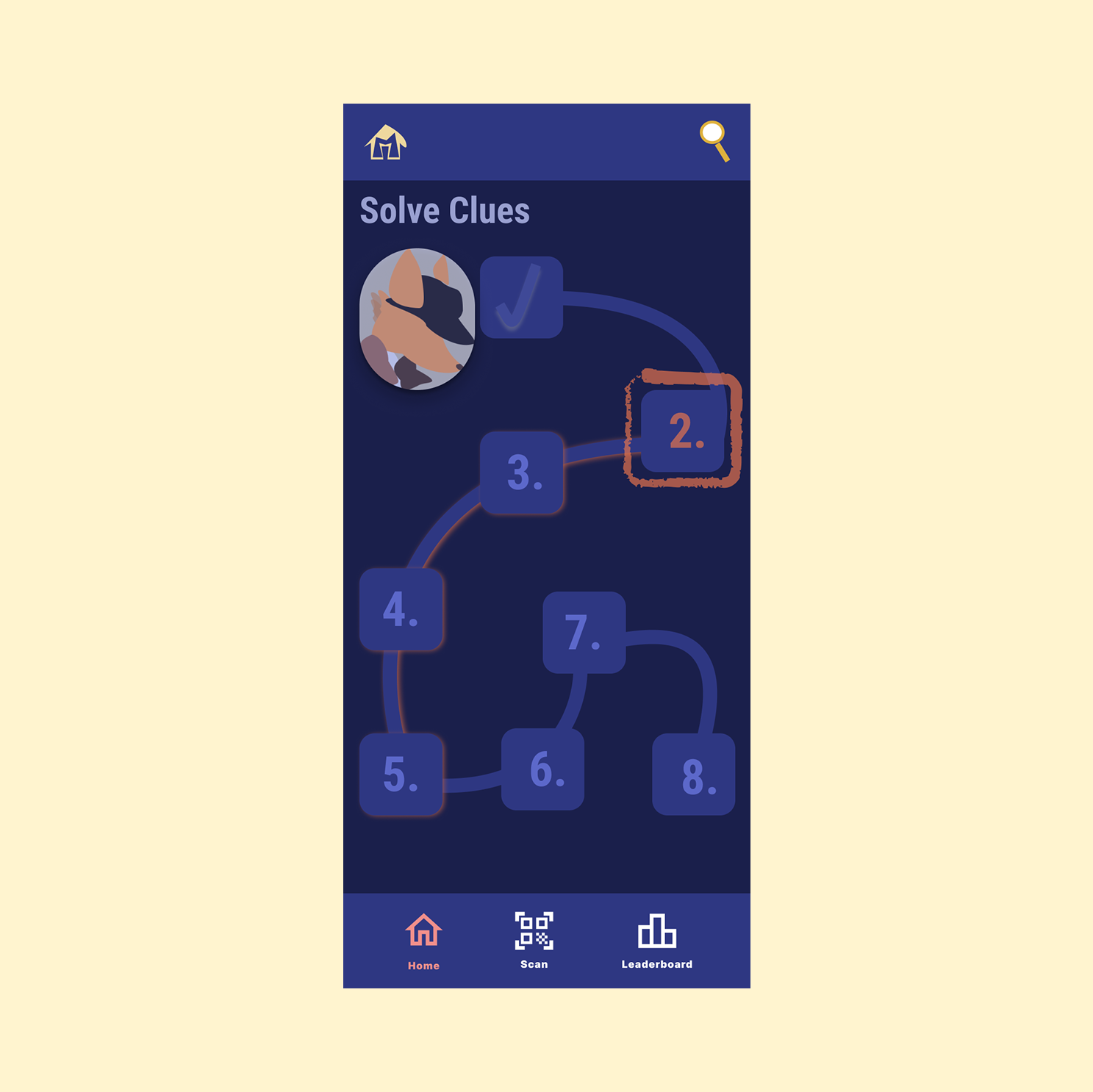
By marrying the audio tour to the premise of a scavenger hunt experience, providing an immersive narrative that guides participants through exhibits, adding an extra layer of storytelling and engagement.

From this triangular frame I outlined different tasks the app should accomplish:
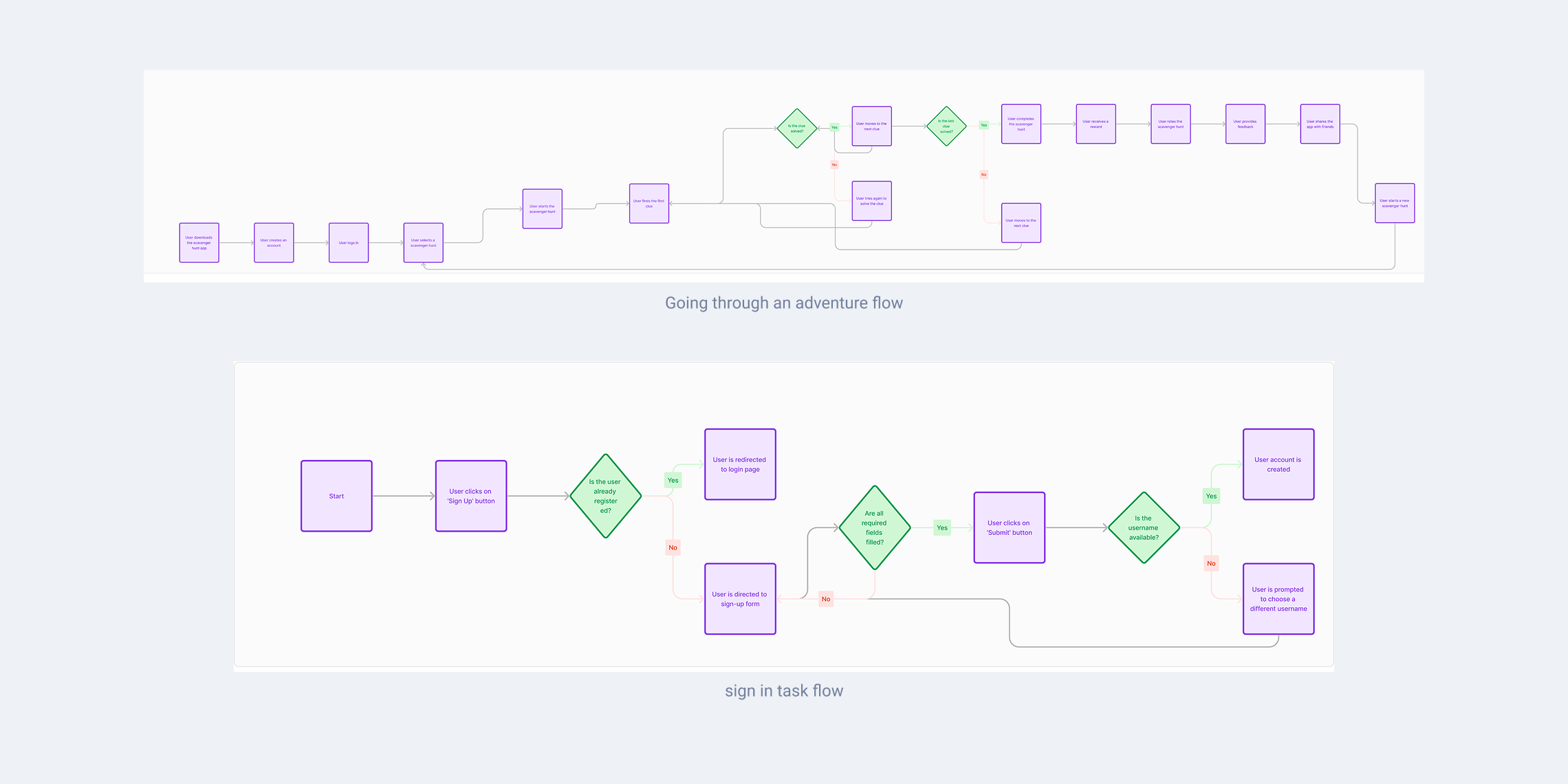
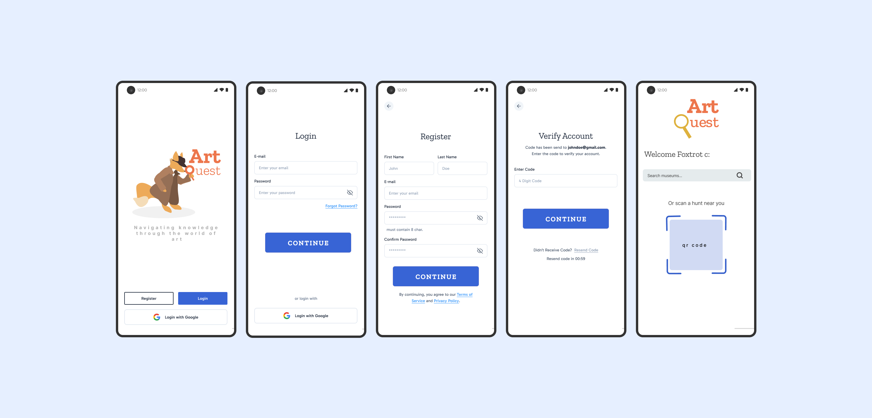
Building from the flows, I created rough wire frames for the client's review. I focused on making sure the flows were accounted for and that each screen would access all the options through the menu task bar.
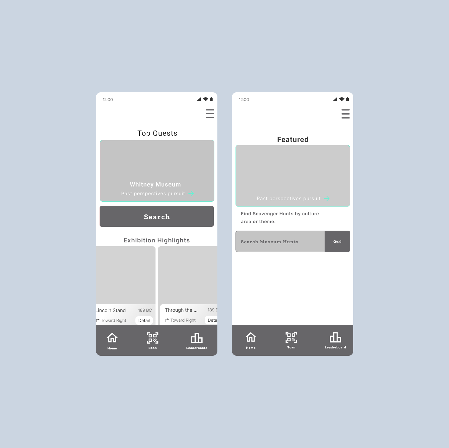
For the build of the app, I took a color survey of the top educational apps in the Google Play Store. Most of these apps exuaded warm and cheery tones and the ones that drew my eye the most bordered on a neon hue. I wanted the app to work well within other museums existing setting thus I chose a palette that focused on a contrast and. The deep salmon orange balanced with cerulean is eye catching and fun, and hopefully relieves some of the stuffiness of going through a museum.
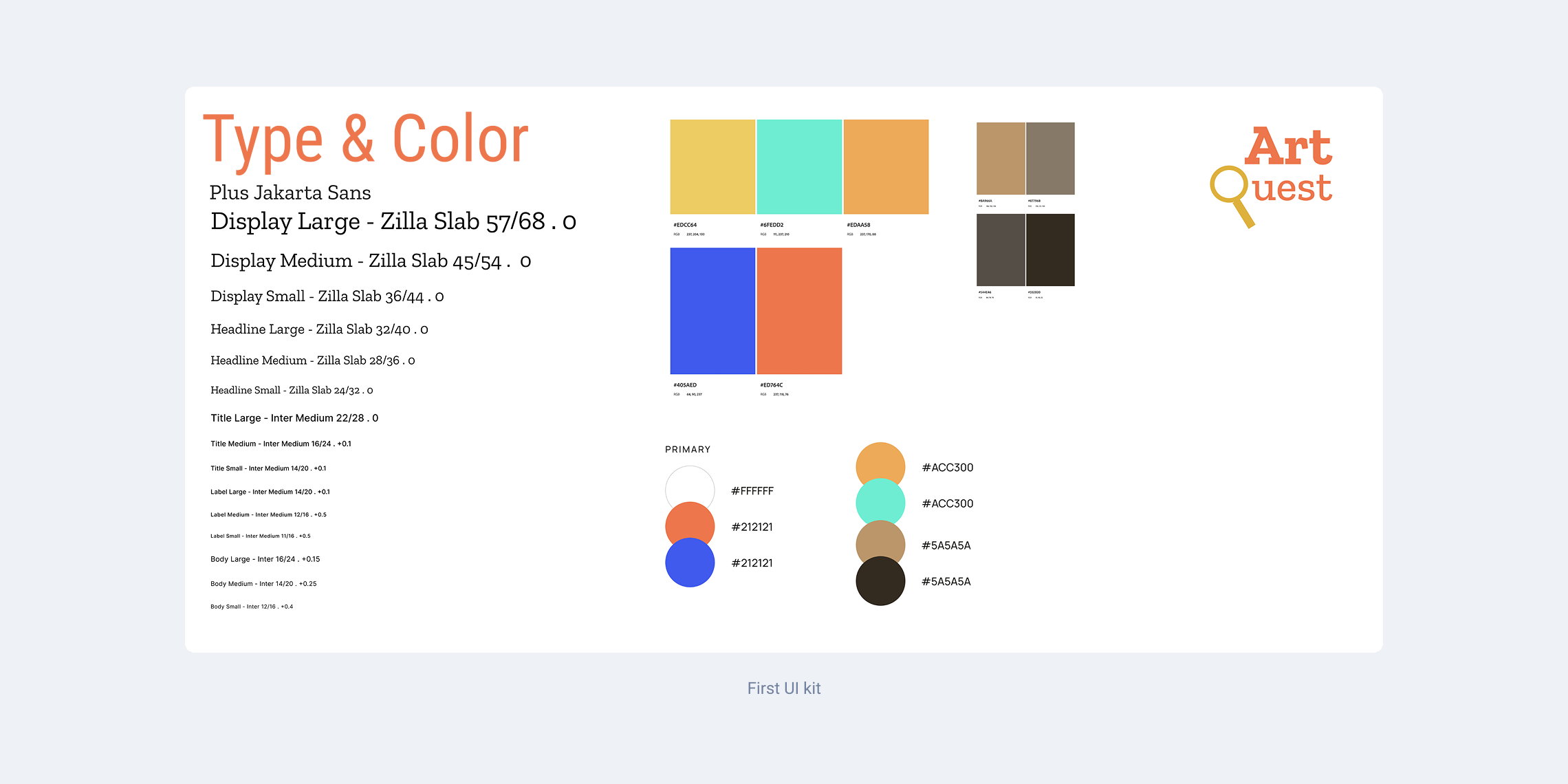
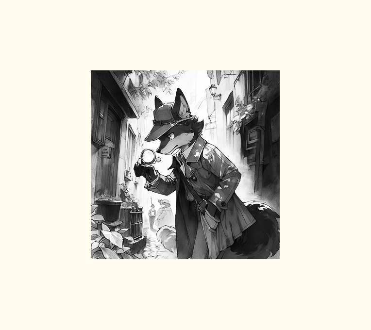
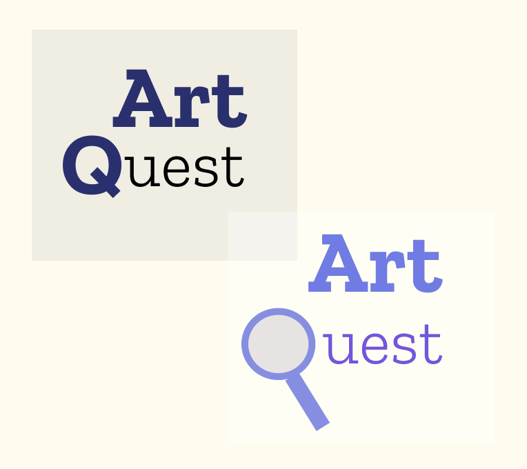
I created hand-drawn illustrations throughout the case study to reflect the playful, exploratory spirit of ArtQuest. The mascot began as a simple oval shape in Figma, evolving into a friendly character inspired by the client's original concept. The final logo and visual identity blend academic curiosity with a whimsical tone, aligning with the product’s educational mission.


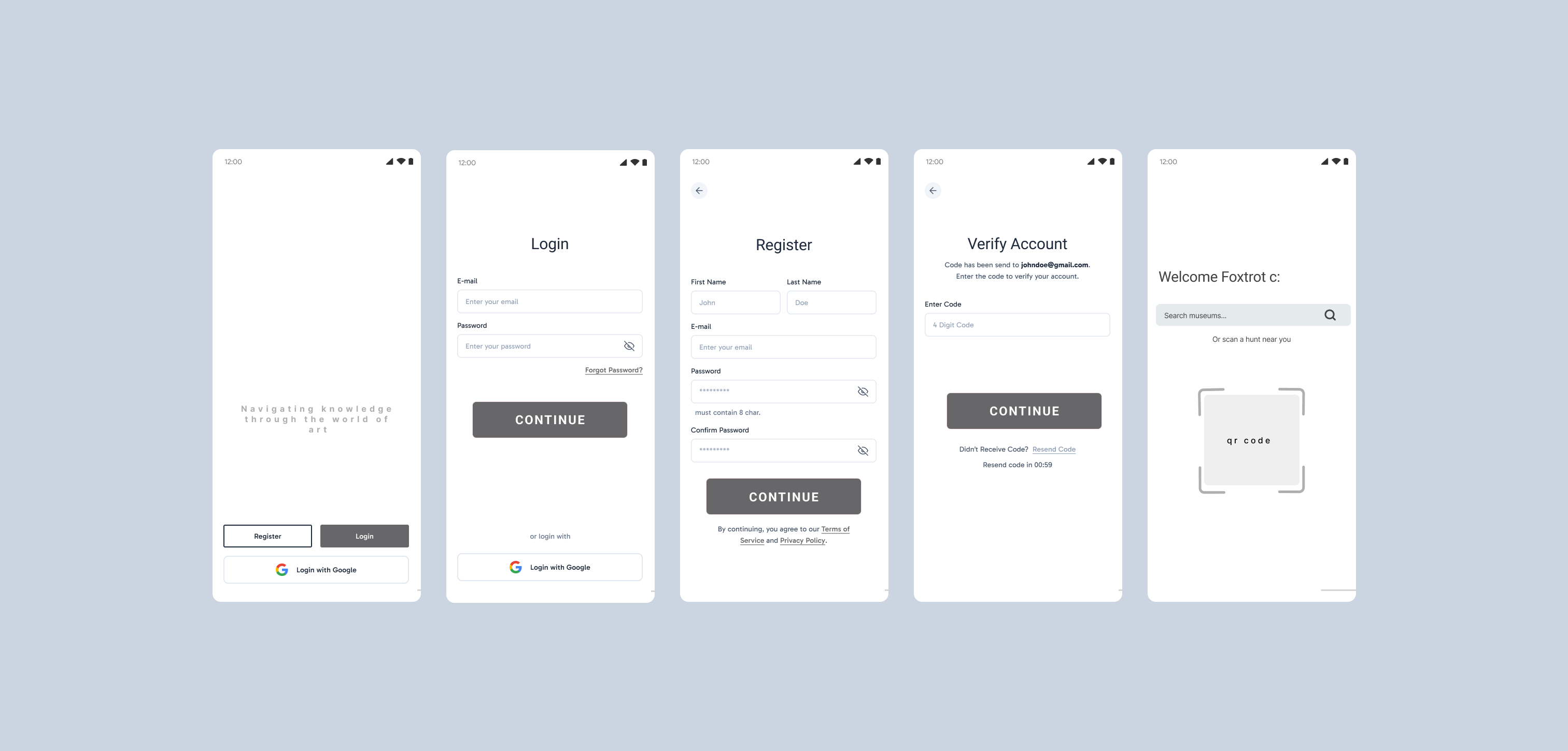
Building out the sign in process to include a qr code so that visitors can scan upon entry. The goal is easy sign in and eventually become a member.
This setup allowed us to standardize incoming requests, reduce email clutter, and increase visibility across the team. It also made the process more trackable, since tasks were now organized in a shared digital space with deadlines, status tags, and assignment options.
After a few rounds of testing, we gathered the home screen was causing confusion and didn't give users enough information on how to use the app. We also received the feedback that the Profile and Rewards page was not visually accessible and made significant updates to solve this.

.png)