

Create a scalable and manageable website that allows individuals to book craft classes.
Audited the existing weddings page content and structure. Identified gaps in hierarchy, tone and calls to action. Defined user types, needs, and goals.
My role as the lead designer was to refine the brand’s digital presence and create an intuitive e-commerce experience that reflected the studio’s craft experience.
I began by hosting a collaborative discovery workshop with the client. Together, we explored their goals: boosting sales of craft classes and improving how customers previewed the class pages.
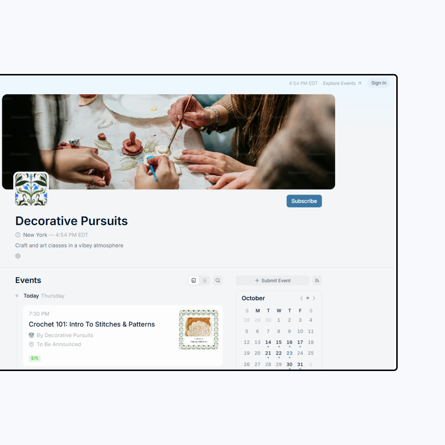
The classes were only hosted on Luma.com and Eventbrite and so the client requested an online presence that would increase bookings.
The client admired the energy and community feel of craft hubs like Happy Medium in NYC and wanted to bring that same sense of creativity and connection to their platform. Through a series of discovery sessions, we identified key values: warmth, creativity, and accessibility.
I began with mood boards that explored the tactile qualities of craft—textured fabrics, brushstrokes, soft color palettes—and mapped them to a digital environment. From this, I built a creative direction system that merged natural materials with modern minimalism.
Outcome: We defined the primary audience as creative beginners and hobbyists seeking community-based learning experiences. This informed everything from the visual tone to the way class information was structured.
Because the client was building this as both a creative brand and an e-commerce platform, I worked to prioritize the design roadmap based on impact, effort, and launch readiness.

We started with a core MVP focused on three user journeys:
Secondary features like the instructor bios, student showcase, and gallery were planned for phase two, ensuring we could launch quickly without overwhelming early users.
I mapped out a 10-week roadmap in FigJam and Notion that included design milestones, client feedback loops, and user testing checkpoints. This approach helped us keep creative decisions aligned with business needs, and ensured that both brand storytelling and booking flow development moved in tandem.
.png)
By maintaining transparent communication with the client and using Figma for progress reviews, we were able to ship the MVP two weeks ahead of schedule.
The discovery phase centered on translating the brand’s values—community, creativity, and craftsmanship—into a digital environment. Through stakeholder interviews and brand workshops, I uncovered a shared desire: to make the experience feel like entering a cozy, light-filled studio.
I led a co-design session with the client, using Miro and Figma to storyboard potential user flows. We sketched three directions for the customization feature:

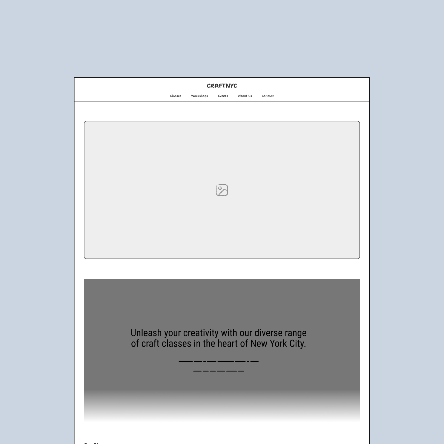
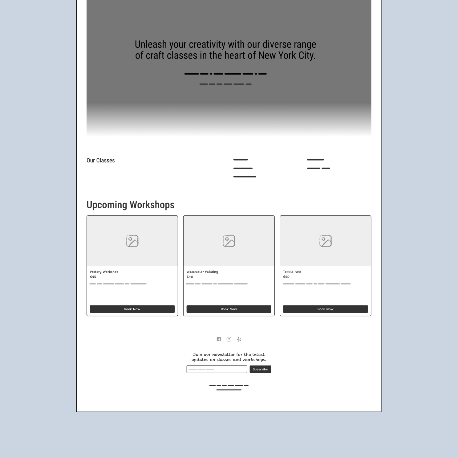

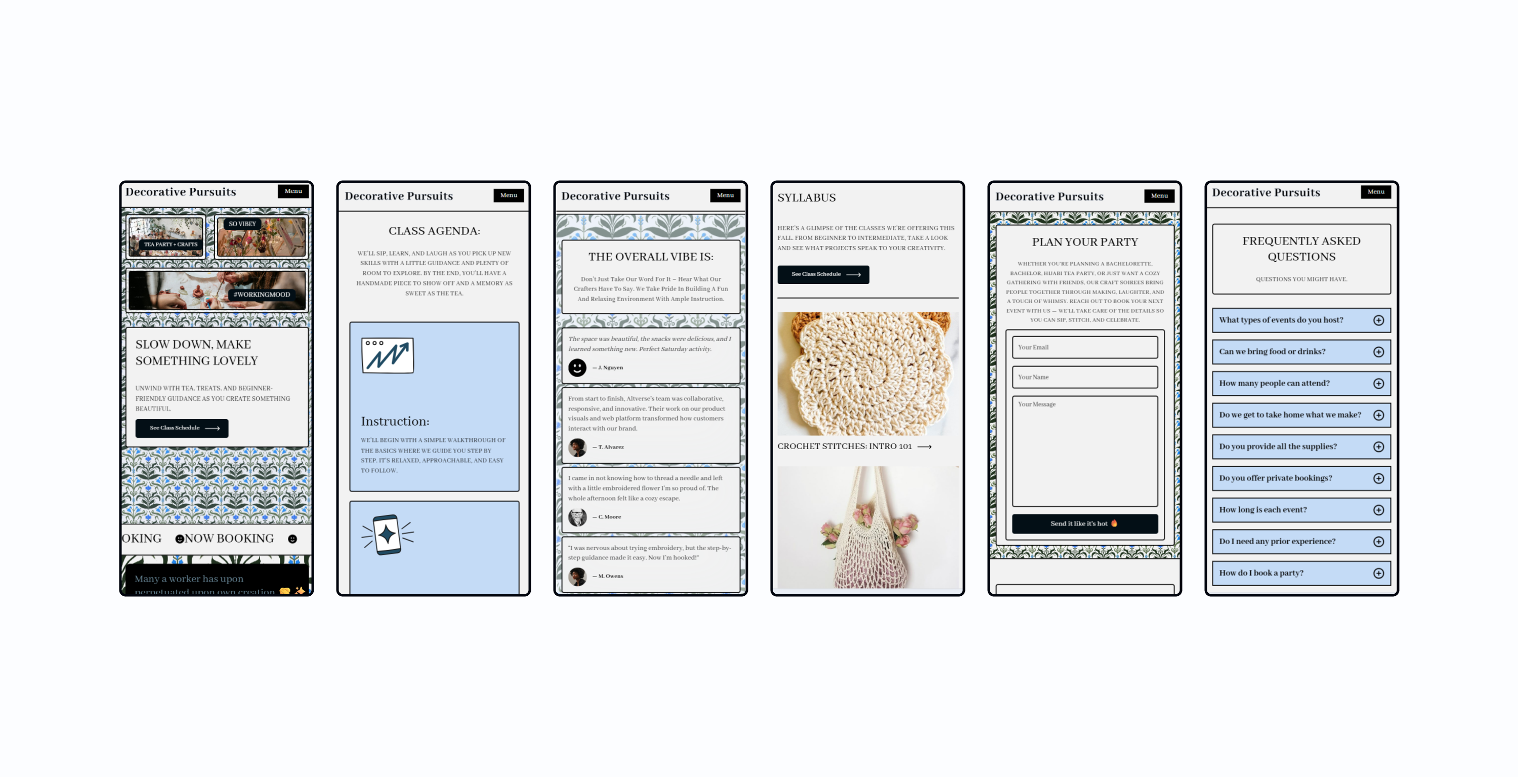
From that vision, I developed a UI kit in Figma that combined modern usability with subtle ornamentation. Every component was designed to reflect tactile craft traditions without sacrificing simplicity.
Components: Built scalable design components (cards, buttons, class tiles) with consistent spacing and color tokens, allowing the site to grow without visual clutter.
Palette: Inspired by craft materials—linen beige, indigo ink, sage green, and blush clay. The palette evokes the warmth of handmade textiles while ensuring strong contrast for accessibility.
Typography: I paired a soft serif for headings (reminiscent of letterpress craftwork) with a clean sans-serif for body text to maintain modern readability.
Icons & Motifs: I designed small flourishes—thread-like dividers, embroidery stitches, and watercolor brush marks—as modular elements. They added character but remained light enough to not distract from usability.

Result: Together, these details created a tone that was both ornamental and contemporary—an homage to the decorative arts movement while celebrating craft in the digital age.
The homepage was designed to tell a story. It opened with a full-width hero image of hands mid-craft, anchored by a clear CTA to “Book a Workshop.” Below, users could browse by craft type—crochet, embroidery, or watercolor—or discover featured instructors.
Key homepage features:
Below are the sections outlined to transform the client's current page.
Result: Together, these details created a tone that was both ornamental and contemporary—an homage to the decorative arts movement while celebrating craft in the digital age.
Below are the sections outlined to transform the client's current page.
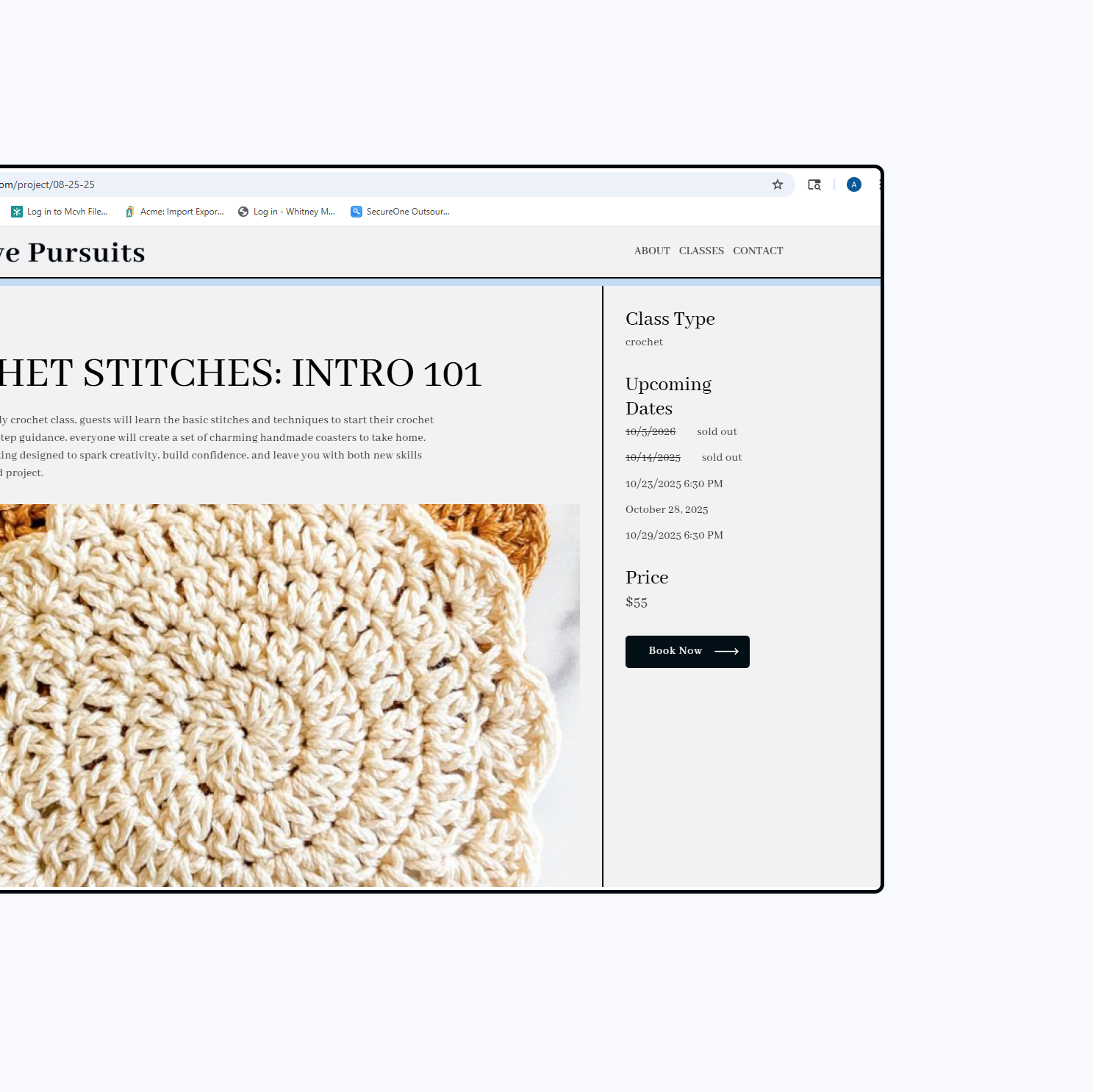
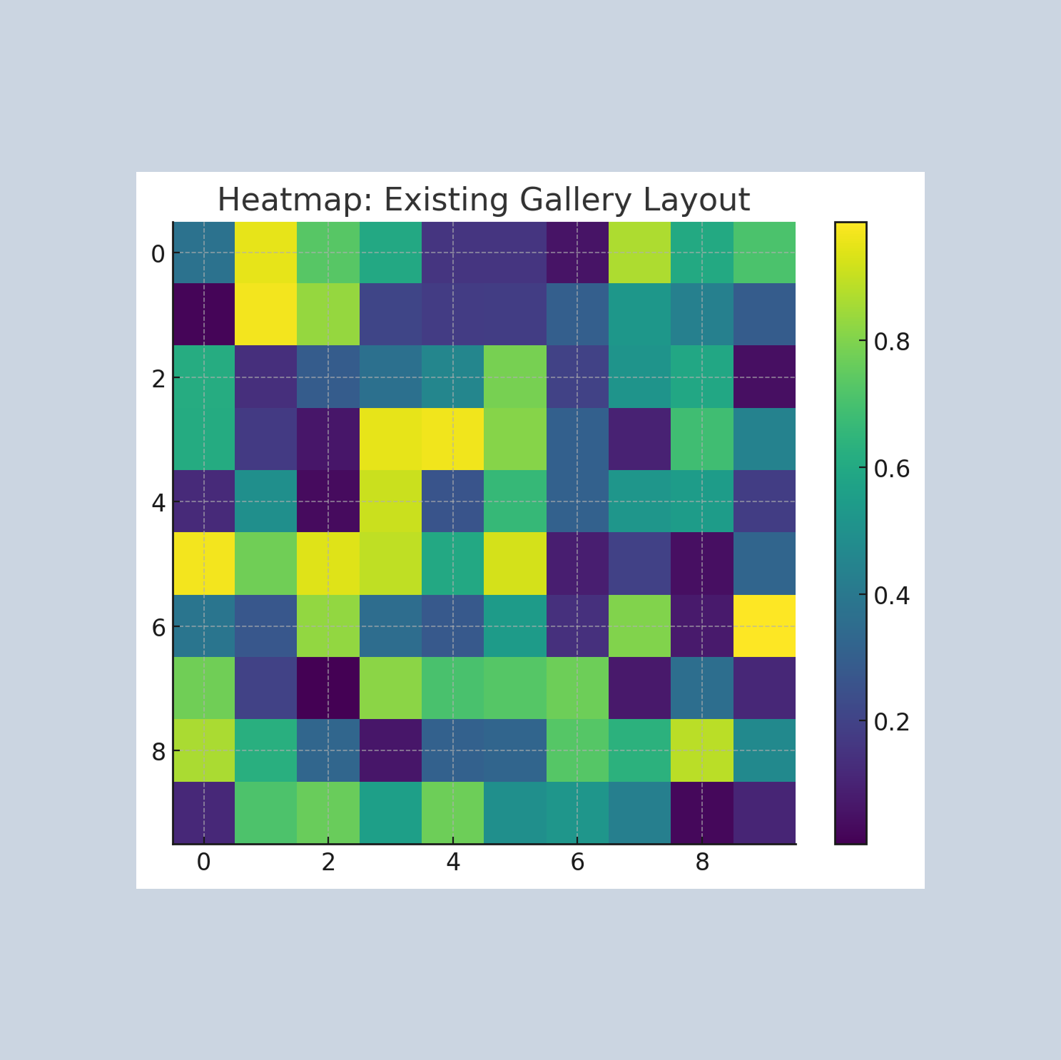
After launch, I continued testing the user experience with both returning students and new visitors. Heatmaps and session recordings showed that users were lingering longest on the class gallery pages but not always converting.
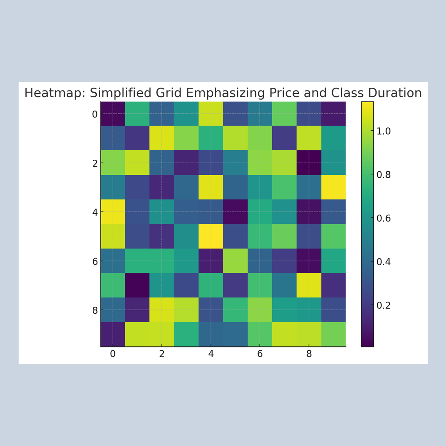
I ran a small A/B test comparing the existing gallery layout with a simplified grid that emphasized price and class duration. The revised layout performed better, increasing conversion rates by 15%.
I also refined visual hierarchy by adjusting color contrast and increasing button prominence for mobile users. Mobile bookings soon accounted for 70% of total sessions, validating that our responsive design approach worked seamlessly across devices.
These cycles of testing and refinement helped evolve the platform from a static booking site into a living, evolving product informed by real user behavior.
Scattered attention because each card has many visual details (image-heavy, mixed information hierarchy).Users exploring all over the place without clear guidance.Some items pulling attention more than others due to visual style, not usefulness.
This usually means shoppers may browse longer but convert less because there's no quick, scannable way to compare classes.
This version is designed to help users make quicker decisions with fewer distractions.
After launch, Decorative Pursuits saw meaningful engagement growth:
Average session time: +45%
Mobile bookings: 70% of total transactions
Repeat customers: +28% within two months
The client received consistent praise for how “welcoming” and “easy to use” the website felt—feedback that validated the intentional balance between artistry and function.
Decorative Pursuits taught me how deeply visual language can shape emotional resonance. By drawing from the Arts and Crafts movement, I created a design that not only looked beautiful but carried the same values of intentional creation, community, and care that the brand embodies.
The result was more than a booking site—it became a digital studio, a place where the warmth of handmade art meets thoughtful technology.